 Last week, Ellen wrote about improving conversion rates on landing pages. Today, I’m going to take a deeper dive into the elements of an effective landing page.
For those unfamiliar with the term, landing pages are web pages that allow you to capture a visitor’s information through a conversion form. Think of them as a sales rep that is working 365, 24/7 for your business. Capturing leads through landing pages is not only an effective method of lead generation but has become a primary and vital method for any business to build out the top of their sales funnel.
While landing pages should not be thought of as a one-style-fits-all tool, there are certain elements of a landing page that must be included in order to garner optimal results.
According to Hubspot, the elements of an effective landing page include a headline, hidden navigation, context, images, and forms. At Imagine, I have utilized these elements along with other components to create landing pages that fulfill their purpose of converting visitors to leads.
When you’re creating a landing page, there’s a lot to pay attention to. If you’re like most marketers that I know, you’re in the middle of a lot of things when putting landing pages together. So, I thought it would be valuable if I shared the checklist I use when creating landing pages for our clients.
Implementing these components into your landing page building process will help to ensure you receive the gift of inbound generated leads throughout 2016. Here we go!
1. Choose the right template
There are a multitude of template options for any landing page and what works for one business may not be the best option for another. Your template should be aesthetically pleasing while providing sufficient space for images, forms, and text. To figure out which template works best for prospects we recommend A/B testing.
Once you’ve determined which template to use, it is time to focus on the copy. The first place to start is with the headline.
2. Ensure the headline uses actionable, value-driven words
When creating your headline, ask yourself- does the headline entice someone to take action and does it explain what the offer is? Remember the goal of a landing page is to get the prospect to then take the next step in filling out the form so a tempting and persuasive headline is a must. When creating a headline, I always ask myself if I came across this headline would I be tempted to fill out the form? If the answer is no, I go back to the drawing board. The more enticing the headline, the more conversions your landing page will generate.
3. Headline matches the source copy and the sub-header concisely describes the benefit of the offer
One of the more frustrating aspects of researching anything online is the feeling that you’ve been duped. You click on a link for an offer only to find that you have been taken to a page that does not deliver on the information you were hoping to receive. Not only will conversions on that offer plummet but your calls-to-action (CTAs) will be met with skepticism the next time that prospect comes across an item of interest on your website. For these reasons, your headline must correspond with the CTA copy that they initially clicked on. This is a practice I follow religiously when creating landing pages for Imagine. Just below, your sub-head provides further opportunity to intrigue the prospect. Creating a sub-head that concisely describes the benefit of the offer further confirms that they will be receiving just what they were looking for without going into too much detail.
4. Body copy should be scannable, scrollable and compelling
Is the copy action-oriented? Is the copy value-oriented? Does it answer 'so what' and convince visitors that the offer is worth the prospect’s time? These are questions I ask myself everyday. Make sure you ask yourself these questions when writing the body of your landing page. Additionally, make sure your copy is written in second person and has carefully placed keywords and/or phrases throughout. The keywords are necessary to ensure your landing page carries SEO value which is imperative for organic search rankings for your website.
5. Meta description
A meta description is an important aspect of any web page and landing pages are no exclusion. In case you're unfamiliar with the term, a meta description is the clip of information below the link of a search result. The goal of a meta description is to explain the subject of the page to the searcher and could make the difference between a prospect clicking your link or the link directly above or below you in the search results. Your meta description should use enticing verbiage to describe the offer featured on the landing page, while utilizing targeted keywords. Remember, the meta description is specifically for search purposes, so if you want your offer to be found via search engines, an effective key word strategy is critical.
Lastly, when creating a proper meta description, it is important to use no more than 140 characters which is typically 1-2 sentences. While cutting down the description can be tough, I have found that concise meta descriptions explain our offers more clearly which ultimately leads to more views. If longer than 140 characters, your meta description will appear jumbled in the search results and won’t provide much value to the searcher.
6. Images
On average, articles with images get 94% more views than articles without images and landing pages with images perform better as well. However, any random image won’t do. Make sure the image you include is indicative of what the visitor will receive after filling out the offer. Attaching alt-text, describing the picture with key words is also important and must be done to optimize your page for all-important SEO purposes. Lastly, make sure your image is high resolution. To the person viewing the offer, a low quality picture could mean a low quality piece of content. At Imagine, we invest significant time and money to ensure our images paint the proper picture.
7. The form
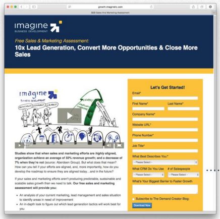
The form is the most important part of the landing page because it provides the mechanism for capturing the lead. For TOFU (top of the funnel) landing pages, forms should be kept short requiring only the most basic information such as name, email, company name, job title and website url. For BOFU (bottom of the funnel) landing pages, the information gathered from your form should be more in depth. For example, at Imagine we add fields to capture more detailed information like what CRM they use, the number of salespeople in their organization, and what’s their biggest barrier to sales growth.
Additionally, the submit button should be customized with action-oriented language and the form should be enabled with progressive profiling for return visitors. This simply means if a lead has provided you with information previously they won’t be asked to provide it again.
Lastly, when the form is submitted, the lead should be redirected to a thank you page with navigation, providing instructions on how to access their content.
8. Landing page layout
Does your landing page pass the blink test? In other words, will it grab the attention of a visitor? Within 5 seconds, the person viewing the page should know what your landing page is about and also know how to receive the offer behind the page.
It is also important that the navigation menu is removed from landing pages. Remember, the goal of the page is to get the visitor to fill out the form. If they are distracted by where they can go next, it may hurt your conversion rates.
Lastly, make sure your layout is responsive to both mobile devices such as cell phones and tablets. Before finalizing a landing page, I always refer to the preview feature within Hubspot to see how the page looks on various devices.
Creating effective landing pages is worth your time and effort. I hope this checklist helps you reach your conversion goals!

