I don’t know about you, but for years the thought of a website redesign made A Nightmare on Elm Street feel tame. There is probably no marketing tactic where I have spent wasted more money and experienced more frustration than on website redesign projects.
What’s worse, by the time most people are (finally) done with a website redesign, the messaging is already old and out of alignment. As the sales and marketing efforts and other business functions like recruiting evolve, the website falls further and further out of alignment with everything. But, you stick with a website you don’t love because the cost and frustration associated with making changes is too high.
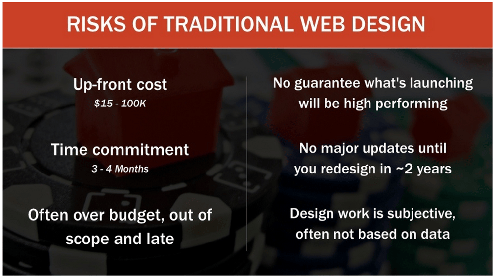
For mid-sized B2B sales organizations, the traditional approach to web development is broken. The good news is that it doesn’t need to be that way. There’s a new approach to web development that can eliminate these frustrations and enable selling organizations to utilize their website to drive faster sales.
Luke Summerfield of HubSpot calls this approach growth driven web design. As Summerfield points out, traditional web design is both costly and not particularly timely.
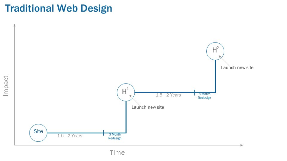
Growth driven web design is built upon an iterative process whereby you continuously adjust, refine and evolve your site based upon:
- Actual data to support what’s working and what’s not working.
- Enhancing conversion paths.
- The evolution of your messaging and overall go-to-market approach.
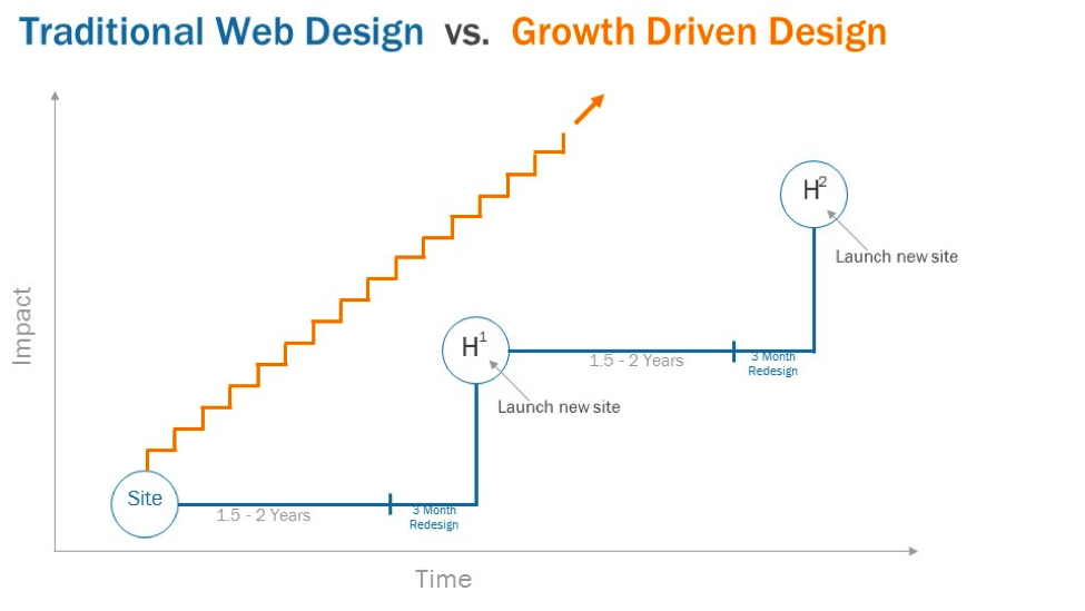
Growth driven design comes straight from the Agile planning playbook. Rather than planning to do everything at one time, you focus on iterations, or sprints, that are shorter in term, less risky and less costly.
Because you are able to test assumptions and utilize data to drive each iteration, you make much more progress; faster than you would with traditional approaches. For example, you may start off with a focus on improving conversion paths. As you complete a couple of iterations and you gain confidence, maybe you move to the user experience or personalization.
Example of a rollout:
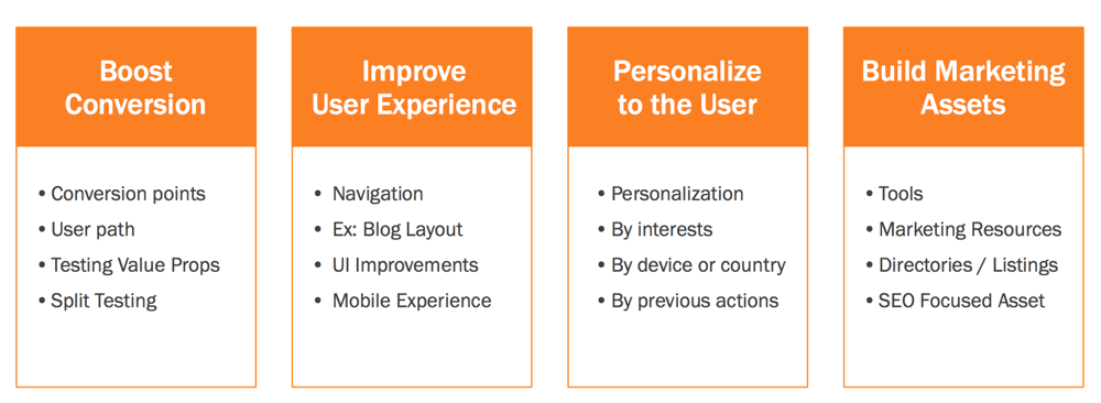
The flexibility built into this approach ensures that the most important arrow in your sales and marketing quiver is always in alignment with the larger strategy and approach.
Some Tips When Beginning the Transition to Growth Driven Design
About two years ago, I was completely frustrated with how difficult web development had become and was nearly paralyzed by our inability to get our own website or the sites of our clients in order. I decided it was time to try a completely different approach.
At the time, I didn’t call it growth driven design. In hindsight, I see that’s precisely what we were doing. In the last two years, we’ve overhauled our website and five client sites. Keep in mind that we are not a web development shop, but the central importance of the web to lead generation and sales development put us in a position where we had to lead clients to make important changes.
There are three key results that have emerged from these efforts:
- The process has been minimally frustrating. Sure, as the initial new site is about to go live there’s a swarm of issues that need to be addressed. But, all things considered, the issues have been minimal.
- The time to a new website has been between 45 and 75 days.
- In every instance, the new site bore immediate results in the form of greater traffic and leads.
During that time, we’ve learned some important lessons about aligning your website (and it’s development) effectively.
Begin With the Minimum Redesign
The term “minimal viable product” is one used regularly in technology. What it means is that rather than trying to create a new product (or upgrade) that addresses everything, focus on the minimal improvement that will get a result.
The same approach is effective in redesigning your website. With most of the clients we work with, there are one or two acute issues that need to be addressed:
- The look and feel of the site is old or ineffective (or is not mobile compliant).
- The site is not built to convert visitors to leads (which plugs closely into the design issue).
So our focus is only to achieve that in the first phase. We do not attempt to re-content the site or to update what’s on every page (though we do typically create a few new pages and eliminate some old ones).
The result here is that we get a new site that gives our client a stronger position and enhances lead generation.
Build Other Changes Into a Phased Approach
With the minimum viable website laid out, every other item that someone wants to address or change goes onto a post-execution wish list. Based upon that list, we create phases to address. Here’s a common process we take with clients:
Don’t Address More Than One Stakeholder At A Time
The biggest thing that bogs down web development projects is that everyone in the company wants to have a say in what the site does and how it works. Human resources is worried about how the site will be used for recruiting, account management wants to use it to enhance efficiencies, and so on.
With this approach, we make sure that we are only addressing one stakeholder at a time. We lead this by explaining that, at worst, the changes we are making represent no change and that we’ll be able to address their needs in a predictable and low stress manner.
It’s Better To Make Lots of Little Changes Than A Few Big Ones
An unexpected benefit of this approach is that it’s very SEO friendly. Search engines like to see websites that are regularly kept fresh and up-to-date. The nature of such an iterative approach plays nicely with search algorithms.
Additionally, because you’re never focusing on something huge you don’t face big roadblocks or barriers to progress. It’s easier to tie the investment you’re making into your site into results.
Don’t Get Hung Up On Small Things
Lastly, don’t sweat the small stuff. If you can’t address an issue in this phase or iteration, you’ll be implementing the next iteration quickly and can address it then.
Be Sure You’re Using a Content Management System That Makes Changing Anything Simple
Another barrier to keeping your website relevant is the difficulty of working with a particular content management system (CMS) or web structure. You’ll want to make sure you build your site on a platform that lets you adjust quickly, easily and seamlessly. We use HubSpot for this.
Growth Driven Design In Action
I feel like I’m about to show you childhood pictures now and I have to admit that I’m a little embarrassed.
Eighteen months ago, this is what our site looked like:
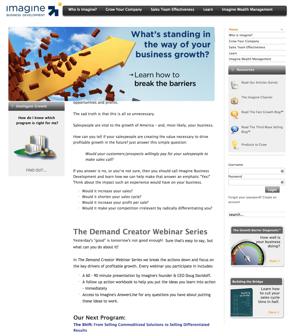
As I look at it today, I have to admit I’m a bit surprised that we were actually able to get clients with it. I remember getting phone calls from prospects who said that they had looked at our website and I remember thinking, “Oh no! Please tell me you didn’t look at it closely.”
The site was poorly designed, was difficult to navigate and had no natural conversion paths built in. Everything we did to create conversions was a hack.
Frankly, I had hated my site for a least a couple of years and had even started two initiatives to redesign the site. One went so badly that I ended up spending more than $10,000 and decided to just kill the project.
That’s when I had the epiphany that I referred to earlier. Rather than adjust everything, we decided that we needed a site that:
- Gave a more modern look.
- Was easier to navigate.
- Highlighted our content better.
- Was more naturally built for conversion.
So in September 2013, we launched this site:
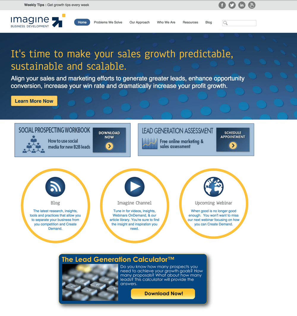
Not perfect, but a noticeable improvement. Immediately, we saw increased traffic and magnified lead generation.
Within a few months, we were already feeling some growing pains associated with the site. We learned that visitors we’re confused (you can’t see the whole site in this picture). We gave them so many choices they didn’t know what to do.
Additionally, while the design was an improvement is was still too busy.
In July 2014, we launched this:
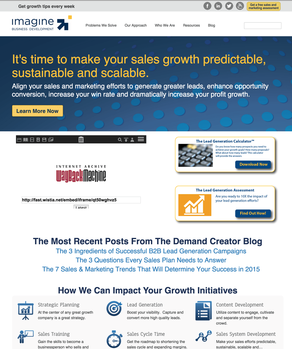
Here again we saw immediate improvement in traffic and conversion. In the process of the redesign and in our efforts to simplify everything, we realized that there were several areas we needed to get clarity on before we changed the focus of the site.
Because we knew that we were going to be regularly updating the site, we didn’t let this lack of clarity stop us from improving what we had.
As we gained the clarity and had more data to back our choice, we launched this in March 2015:
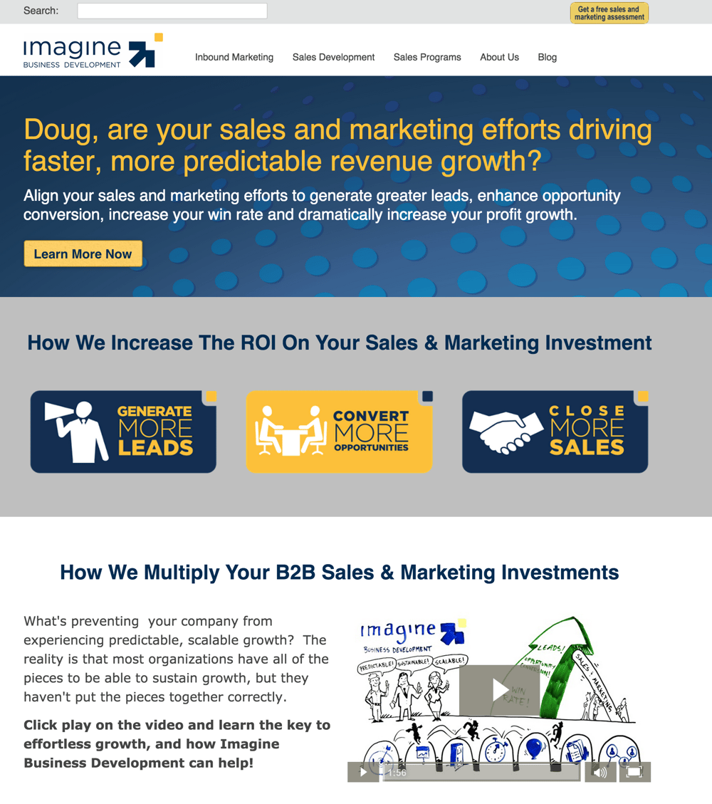
In the 18 months represented here, our web traffic has more than tripled and our lead conversion is up more than 800%.
Since March, we’ve made three material updates to aspects of the site (having nothing to do with design itself), each of which brought improved results.
Today when someone says they’ve been to my website, I smile. If they haven’t, I do everything I can do get them there. The bottom line is that over the last two years, I’ve spent less than half of one website design project and experienced results that are off the chart.
You simply cannot ignore your website today. By using a growth driven design process, you’ll quickly see the frustrations you have with your website disappear and you’ll gain the ability to focus on what you always wanted to…growing sales and profits.

 Doug Davidoff