 For fun, the next time you’re with a group of marketers, entrepreneurs or executives ask them, “How many of you like – really like – your website?” After they’re done squirming, you’ll see that very few do.
At Imagine, we meet with many businesses looking to grow. Surprisingly, the majority of them have outdated websites. This happens for countless reasons.
Some just haven’t had the resources to dedicate to their website, some do not have a marketing person or staff to focus on it and some haven’t yet drawn the connection to their website and growth. Of course, another reason that we’ve shared before may be that a root canal is often preferable to taking on a website redesign project.
Websites have become your hub for all go-to-market and growth initiatives. We use them to educate our prospects on the issues that keep them up at night. We use them to house our blogs. We use them to demonstrate social proof. We use them to share our awesome content.
Websites have taken the place of many of the initial conversations we once had with our prospects. The ZMOT has made your website a critical piece of the growth equation.
In the past, websites were the equivalent of an online catalog. Prospects visited to simply find a phone number or check on a product number. Today, they are much more.
Some months ago we were talking with an executive about the need to update their site, and he replied with a frustration shared by many, “What’s the point? By the time we’re done updating it, it will be behind again.”
With that in mind, I thought I’d share the five musts for a B2B website in 2015 and beyond. If you find yourself in a position that requires you to revamp your site, be sure to take these into account.
1. Clear conversion paths
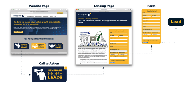
When a prospect visits your site, the goal for marketers is to convert that visitor into a known lead. We do this by creating conversion paths.
Conversion paths are typically made up of four main elements.
- A content offer that the visitor will be interested enough in to provide their contact information.
- The call-to-action (CTA) that a visitor clicks on.
- A landing page that focuses on the content offer where the visitor shares information in exchange for the offer.
- A thank you page (and corresponding email) that delivers the content and leads the visitor further into engagement and down your funnel.

On the Imagine site, we introduce visitors to several possible conversion paths on our homepage.
Depending on the path a visitor takes, additional offers are made available. For example, if you select Close More Sales from our homepage, you will see these offers:

Only one of the offers is the same as those that are on the homepage. The same is true for the other paths a visitor may take – there are several offers available. Our blog also has multiple offers appearing on the right hand side of the page. The point is – our offers are clear and available everywhere on the site.
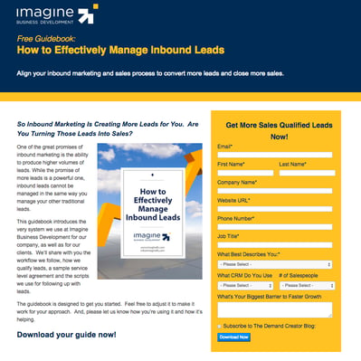
When a visitor clicks on any of our offers, they see a landing page like this one. It clearly identifies what the person will receive and how they can use it.

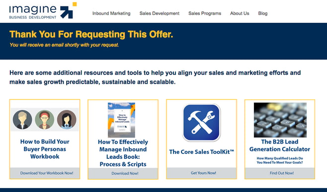
The landing page is followed by this thank you page. It provides the lead with access to the guide and to additional resources.

One of the main goals of every website in 2015 and beyond is lead generation. Clear conversion paths are vitally important to this effort. As you plan your new site, make sure you’re identifying multiple conversion opportunities for all of your primary buyer personas and be sure to make each path clear and easy to follow.
2. Context and personalization
Let’s say you’ve been researching a particular service for several months. You have visited the websites of many providers, downloaded content that was helpful to you and are starting to narrow the field of possible vendors.
When you go back to vendor #1’s site, you are greeted with a personalized message and new content offers that you haven’t seen but are relevant to you. Even though you haven’t spoken to anyone from Vendor #1 yet, you feel like they know you.
When you visit vendor #2’s site, it looks the same as it did the last time your were there – same old offers, no personalization. It’s like you have never been there – like they don’t know you at all.
So when you make your short list, will you include #1 and/or #2? I bet #1 makes it for sure. #2 may still get on the short-list but it will be harder to justify.
Prospects, like everyone else, like to feel like you care about them and respect their time and feel their pain. If your website treats them the same way every time they visit, they will not feel that.
When designing your new site, the ability to personalize the user experience and provide context is critical. It is what visitor’s expect and what will keep them engaged with you on their buyer’s journey.
3. Responsive and mobile-friendly design
Over the past several months, having a mobile-friendly website has gotten a lot of attention. On April 21, 2015, Google changed how it ranks pages. Pages that are not mobile-friendly will not rank as high as those that are.
Prospects are visiting your site using many different devices – desktops, laptops, tablets, phones. No matter what device they are using, they expect to be able to interact with your site fully. Make sure your site design is responsive and adjusts appropriately for each device.
Most B2B buyers are not thinking about the type of device they are using when researching their site. It’s your job to make sure they don’t have to.
4. Speed and weight
Today’s website visitors expect your site to be quick. If the page doesn’t load in two seconds or less, there is a strong possibility your visitor will leave.
Page weight has an impact on speed. The weight of your page is the size of each page. For example, when we put the Imagine site through HubSpot’s Website Grader tool, it determined that the average weight of our pages is 2.6 MB which gave us a high score. Anything over 3 MB is considered “heavy” and may make your site slow.
Visitor expectations are very high in this area. Being just a little bit slow can result in fewer leads and fewer sales. Make sure your new site design allows you to be light and fast.
5. Built for change
Change is inevitable. By this time next year, I may be writing another post about website must-haves and chances are the list will be different.
Same is true for your website. Whatever you’re building today may need updating within a few months. Websites are continually changing. They are a living part of your marketing efforts. As you plan for a new site, make sure whatever platform you choose will allow you to quickly and easily make changes.
This summer, Doug wrote a post about Growth Driven Design. It is an approach to website updates that makes changing your site more manageable, efficient and effective. In a post last week, he wrote about how Imagine has used a Growth Driven Design approach to make meaningful changes quickly. The ability to quickly enhance and update your site is key to its future success.
A website redesign can be challenging, stressful, frustrating but also exciting. Creating a site that is built for lead generation is a challenge well worth taking.

