 Hooray! Visitors are coming to your site and converting! They are willingly filling out your forms to get the content you are offering. Congratulations on a job well done. But wait...isn’t that just step one?
What comes next is another opportunity to provide valuable information to your new contact. It’s up to you whether or not you capitalize on that opportunity or let it pass you by like many B2B companies do.
When someone gives you something, your first response is usually to say “thank you.” When a lead provides their name, email address and the other information you asked for, isn’t thanking them the right thing to do?
That’s what thank-you pages are designed to do, but they can do so much more when created with the future in mind.
Stop neglecting your thank-you pages...put them to work for you. Here are 7 ways to get started.
1. Restore the navigation
On a landing page, a best practice is to remove navigation, so the visitor doesn’t get distracted and stays focused on filling out the form. This rule does not apply to thank-you pages! A thank-you page should restore navigation so they can continue browsing your site to find more opportunities to learn about your company.
2. Provide an instant download AND email the offer
When I fill out a form, I’m pretty excited about getting the actual offer. If I’m directed to a page that just says ‘thank you’, without giving me the offer right away, it can be somewhat disappointing. To optimize your page in this case, include the download right on the page, like HubSpot does here:
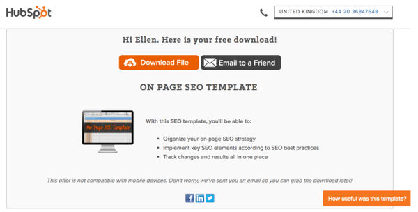
An automatic download leaves people with a positive feeling and can help build relationships with prospects. When you do choose to include an automatic download right from your thank-you page, it’s a good idea to go ahead and send a follow up email with the download as well, so they can access it and navigate back to it easily and readily when they need it.
3. Give them a chance to share or refer others
A great opportunity to reach additional people is to include an “email to a friend” button like HubSpot does in the example above. It doesn’t get an easier to share with colleagues than that!
And let’s not forget about sharing on social media. Thank-you pages are also a great place to include social sharing icons. Be sure to link to the landing page as opposed to the thank-you page to avoid missed conversion opportunities.
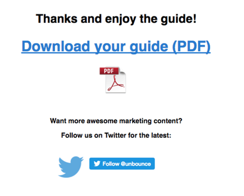
Thank-you pages can also be used as a way to increase your social media followers. For example, Unbounce includes a social sharing option to follow them on Twitter:
4. Include a call to action
Based on the content the visitor just downloaded, you should have a good idea of what type of information they’re looking for or what they’re interested in. Using that information, include a call-to-action on your thank-you pages for another offer that will help to guide the prospect to the next logical step in the buyer’s journey.
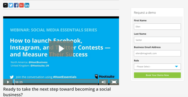
If it’s a top of the funnel download, the additional call-to-action could present a middle of the funnel download, like a webinar or case study. Consideration stage offers present a great opportunity to offer a free demo or consultation. They’ve already expressed interest so why not give them the opportunity to contact you directly? HootSuite includes a CTA for a demo in the example below:
5. Include Testimonials
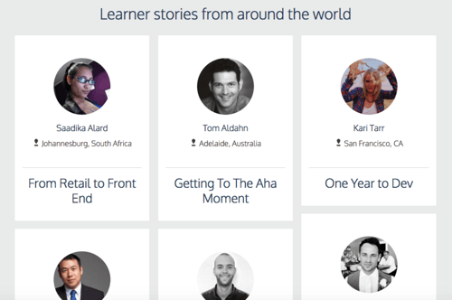
Testimonials can be an extra reassurance to the prospect that they’re headed in the right direction. Positive recommendations will add value to your brand. For example, after signing up with Codeacademy, you’ll see a video called “Life Stories,” with these testimonials at the bottom of the page.
6. Ask them to subscribe
If you’re looking to add subscribers to your newsletter or blog, add an option to opt-in. Offering it to those who are already interested in your written content is a must. It’s a quick way to have them opt-in with one added step, without cramming up their email inbox further down the road.
7. Link to resource center
If you keep all of your content in one place or if you have a resource center where eBooks, slide decks, etc. can be downloaded, add a link that directs them to the additional content. They can choose to browse through and find more helpful content that answers any questions they may have or can direct them to the next step they are approaching in the buyer’s journey.
Thank-you pages are left out of the limelight. You may never think of them as an important asset to your marketing process, but when optimized, they can be a converting machine for your inbound strategy.
If you think you’ll implement these ideas into your strategy this quarter, let me know in the comments below!

 Ellen Welker