 We don’t have to tell you your ability to convert web traffic into qualified leads is a crucially important component of any demand generation effort. Yet, far too often we see that companies who have invested in marketing automation and in the creation of relevant content fail to pay proper attention to key conversion pages.
Conversion pages are those “critical few” pages whose primary purpose is to create a specific action. That action could be downloading a white paper, initiating a chat, requesting a demo, registering for a webinar, etc. The last thing you want is for your customer to land on your page and be confused and leave or take the wrong action. That wouldn’t only cause stress on them, but it would also cause stress on you.
In the world of modern demand generation (and to be really, really trite) the only constant is change. However, despite the range and rate of change, there are still some things that are as true today as they were several years ago. People are still people, and if you want to capitalize on the hard work you’ve put into your content marketing, you’ll want to be sure you're following these five success factors of a conversion page.
While there are dozens (or hundreds) of tips that can help you optimize performance, these five factors are the core attributes of performance.
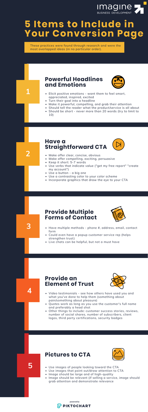
The Five Elements of a Strong Conversion Page
 1. Powerful Headlines and Emotions
Headlines are the first line viewed, so what you input will influence whether the customer stays on the page or leaves. That’s why you should grab their attention right away with something short. You should limit your headline to 10 words, and you should never exceed more than 20 words. One way to grab their attention is to start by thinking about what your customer’s end goal is and turn that goal into a headline. Furthermore, if your headline is accompanied by an image you don’t need to go into as much detail in the copy explaining what the product or service does.
2. A Straightforward CTA
Your CTA (call-to-action) is the most important element of a conversion page. Having a straightforward CTA means it’s clear, concise, and obvious. You never want to have your customer guessing on what action they need to take. This, too, should be short--between 5 and 7 words.
The CTA should stand out from the rest of the page, and the best way to accomplish this is by making it big and/or using a button. If you use a button, it should be a contrasting color to your landing page color scheme.
The other aspect of the CTA is that the copy for it should be compelling, exciting, and persuasive. This means you should use verbs that indicate value to the customer. Instead of saying “Submit” or “Download Now,” the CTA should read “Get My Free Report” or “Create My Account.” This way the action is more directed at the customer.
3. Multiple Forms of Contact
Having multiple forms of contact on your conversion page allows the user to know that they can get to you if they need to. Some of the different methods you should include on your page are: phone number, street address, email, and/or a contact form. You could even include a pop-up chat where a customer can talk with a service representative. Having this feature can help strengthen trust, but note that it isn’t a must-have. If you feel your customer will find value in this feature, then by all means include a live chat. If that’s not how your customer communicates, use a method they would find more useful.
4. An Element of Trust
When customers land on your page, they look for information on whether or not you’re legit, especially since the amount of scam companies has increased over the years. In order to provide this element of trust, include some form of social proof on your conversion page. You can achieve this through video or client quote testimonials. If you include a video testimonial, this will allow the customer to see an actual person that has used the product or service. If you use a client quote, this will do the same thing as the video as long as you use the person’s full name and headshot (preferably). Other ways you can achieve trust is by incorporating reviews, number of social shares, number of subscribers (depending on the CTA you have), client logos from current or past customers, third-party certifications, and/or security badges.
Having testimonials can also provide the element of “something about pain.” If you can get someone to think about their pain points, they will subconsciously seek relief which means they’re more likely to convert. This is especially true if you mention what someone will lose. We as humans are more likely to anticipate the pain of losing something than we are to anticipate the pleasure of gaining something. For example, there’s a different reaction when you compare gaining $100 and losing $100. You’re more likely to feel more emotion over the loss of money. Therefore, incorporate pain points in your testimonials if you choose to implement them.
If you include “something about pain” you have to balance it out with “something about pleasure.” Make sure you are relieving the pain brought up because you never want to present a problem without providing a solution. Therefore, showcase how customers can gain pleasure by utilizing your product or service, and show how your product meets their emotional need(s).
5. Pictures
The brain processes images faster than it does text. Try implementing images of people looking toward the CTA or images that draw attention to the CTA. This can help the customer follow the image over to the action you want them to take. Notes on images: they should be large, high-quality, and relevant. If you’re selling a service, the image should grab the customer’s attention and correlate to your offer since services can be trickier to photograph.
Whether you implement one or all five of these concepts into your conversion pages, remember to “always be testing” to find what works best for you.

