Consider these numbers (source: HubSpot Academy):
- 71-89% of website visitors are looking for content/research to solve a problem, and are not looking to buy anything.
- 11-29% of visitors are evaluating options and criteria.
- 0-18% of visitors are evaluating vendors and ready to buy.
- 50% of online leads are qualified, but are not ready to buy anything.
Think about the implications of these numbers. This means that (conservatively) 80-90% of your qualified potential visitors are not in a buying mode. 80-90% of potential SEO traffic is not looking for information about purchasing a product or service.
Now, look at your website. Look at the content, and the calls to action (if you have any) and ask yourself what stage of the buyer’s journey your information and content point towards. For the majority, it’s inversely related (90% or more of your content is geared to 10% of your potential visitors).
From my experience working with thousands of small and mid-market (SME) B2B companies, along with studying the reams of data on the B2B lead generation model, I’ve established a list of the three most common and damaging website mistakes made by SMEs.
Simply eliminating these mistakes will have a major impact on your results (in my experience it will increase lead generation by a factor of 3 – 7).
1. Poor Site Structure
I have to admit this one pains me, as I was a victim of this mistake myself. In October 2013, we redesigned our website. Now, we have had a fairly effective, ongoing lead generation effort for years. The six months following the redesign have seen a near tripling of leads generated.
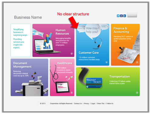
The biggest problem with most home pages is that they try to communicate too much. Further amplifying this problem is that everything you are trying to communicate is done in too small a space (as you see in the example below).

First, make sure that the value proposition you are trying to communicate is clear. Next, ensure that the content you create is geared to your defined buyer personas and is relevant. For all of the content that meets those criteria, use the unlimited space the web provides to keep the structure clean and simple.

2. There is no clear conversion path
I am constantly amazed by the number of entrepreneurs and sales and marketing executives who complain about the inability of their website to drive revenue; yet the only conversion page they have is their “Contact Us” form.
People hunt when they’re online. They’re looking for relevant information, not how to buy your products or services. Your investment in relevant content is useless if you haven’t built the path to convert visitors into leads.
Every page on your site is a conversion opportunity – make sure you’re using your web real estate effectively. Map your buyer’s journey and define where, within that journey, each page of your site fits.
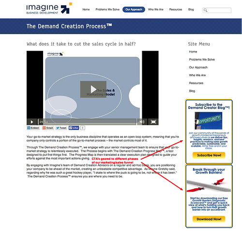
General web pages (like your home page or information pages) should have clear calls-to-action (CTAs), geared to both the top and the bottom of your funnel. Focused pages should have CTAs that are in line with the purpose of the page.
3. Lack of Context For Your Buyer Personas
You cannot have clear, powerful messaging without first being (manically) clear about who your customer is. Clearly defining your “who” is among the toughest acts in business. Once you’ve accomplished that, make that your map that to your website.
We work with a client who has customers in distinctive verticals. When we began working with them, every prospect (and customer) got the same experience when visiting their website – whether they were in an appropriate vertical or not. This led to an ineffective lead generation process, and a lot of time and money wasted in lead triage.
Today, we are in the process of creating uniquely defined journeys. When a prospect is in Vertical ‘X,’ they’ll be exposed to content and CTAs that are specifically geared to the issues that exist within that vertical and connected to their position. When someone visits from Vertical ‘Y’ they’ll be exposed to different content and CTAs than visitors from Vertical ‘X,’ since they wouldn’t have the same issues or benefit from the same experience. This applies to lead nurturing as well.
Consider this (from 3 Cutting Edge Examples of Website Personalization):
- According to Janrain, nearly three-fourths (74%) of online consumers get frustrated with websites when content appears that has nothing to do with their interests.
- After looking at data from more than 93,000 calls-to-action over a 12 month period, HubSpot found that CTAs targeted to the user had a 42% higher view-to-submission rate than calls-to-action that were the same for all visitors.
- A 2013 Monetate/eConsultancy Study found that in-house marketers who are personalizing their web experiences (and able to quantify the improvement) see on average a 19% uplift in sales.
Here’s the good news, fixing these three mistakes is neither time consuming or expensive. It requires some focus and discipline, and the rewards are significant.

 Doug Davidoff