Updated blog from October 1, 2020 with updates to the Pros, Cons, and Use of the Visual Editor.
At the time of the original post, HubSpot had just introduced their new CMS, moving to a theme-based structure (more on what that means later) with drag-and-drop editing capabilities. Since then, HubSpot has been working hard to make improvements to their drag and drop CMS.
What does the transition mean for marketers? No more worrying about that new page your boss asked you to build that doesn’t follow any of the templates you have created. The new CMS has some kick-a** features that will give you so much more control over creating web pages in HubSpot. Now, don’t get me wrong, the CMS isn’t all sunshine and rainbows (but there is a lot of sunshine); that’s why I’m breaking down the good, the bad, and the ugly of HubSpot’s latest website management updates. Now, before we get started, I do want to make sure we are clear: I am a marketer by trade and know enough code to be dangerous ;)
The Structure
First of all, let’s break down the structure of the new CMS. For those of you that have gotten familiar with the template structure, and maybe even loved flexible columns, your world is about to be rocked! The visual editor gives non-technical marketers the ability to create and adjust web pages on the fly without having to submit web page requests to their developers.
Themes
Now at the core of your website design is themes. Themes allow you to set and adjust design elements (colors, fonts, that pesky line height that is just a little too big…) in a single, code-free space.
The Components
Modules - A module is a block of content, whether it is rich text, an image, or a single line of text, that can be used on multiple pages. Other than the fact that you can now drag and drop them onto a page (even if it’s in a new column), these are still developed very similarly. One major difference is that all of your html, css and script should be written in the module itself.
Rows - A row is a horizontal block of content. This could be a single module that spans the page, like a rich text module, or multiple modules in horizontal alignment.
Columns - A column is a vertical block of content. Again, this could be a single module that spans the page, or multiple elements stacked on top of each other.
Sections - I think of this as an update to the term “module group” (at least as HubSpot is concerned). I always give the example of a Russian doll when explaining website structure: A section is the biggest doll, while the modules inside are the smaller dolls. A section can contain multiple modules, rows, and columns. Sections allow you to add background colors or images, which can now be done in the page editor, not just the template or module code.
The Visual Editor
The visual editor is just that, visual! Instead of moving objects on a template and having to go back to the web page (or a template preview) to see what the changes look like, you can now drag and drop any module onto a page, from the page (or visual) editor directly!
The Pro’s
-
Greater flexibility - With some initial help of a developer to set your theme, not so code-savvy marketers can edit and create web pages with little technical knowledge.
-
Themes - Working on a rebrand, have a new logo, or just need to change an accent color? Now you can update and apply the changes site-wide in a single place, without having to understand code.
-
Apply background colors, images, and gradients to sections on the fly - I don’t know about you, but having to navigate to the template editor, group modules together, and then add in a CSS class or add an in-line style, just to “make the section have a grey background” was quite annoying.
-
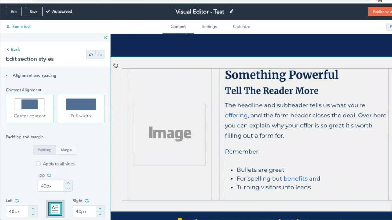
Adjust padding/margin quickly and easily - Again, no need to go to the template to add some space between modules; you can now do this at the theme level, and from the page editor directly. With the exception of some custom modules where this feature is disabled, each element on a page (sections, rows, columns and modules) allow you to adjust your spacing individually.
-
Make changes without a developer - Use the visual editor to drag and drop new modules onto a page and publish in a matter of minutes.
-
Custom modules - Looking for something specific in the asset marketplace? No need to worry about the module’s compatibility! Ok, at least for the most part...Remember how all of the code required for a module needs to be placed within the module itself? This means greater compatibility and flexibility to add elements into your library of assets! Granted - some developers haven’t jumped on the bandwagon 100%, but most assets available are compatible with any theme.
-
Bonus - Since its original launch, the library of available themes has consistently expanded. The marketplace now contains quite the library of free and purchasable themes. All customizable, and even the most expensive pack coming in around the $1200 range!
The Con’s
-
Let’s start with the obvious - It is a new system to learn. It might be a little cumbersome and time consuming initially, but putting the time in up-front will save you time in the long run!
-
Some technical setup is still required - If you are not familiar with, or comfortable with code, you will likely still need to enlist the help of a developer to set up your initial theme and custom modules.
-
Navigation and footer - If you were comfortable enough with templates to update your global modules, you no longer have the same flexibility. Global modules are now hard-coded. I will say that this pain point is one that developers are building more capabilities around, creating toggle switches to add columns and other features that give marketers more flexibility to customize our site.
-
If you are on the old template system, there are some bugs - depending on the templates themselves, there are certain features of the new visual editor that you will not be able to utilize.
-
You won’t be able to add columns to a page.
-
Dragging and dropping new modules may (or may not) work. Or you may only be able to add them in certain positions on the page.
-
Switching over from templates to a theme is a bit cumbersome - Although this functionality has improved since themes were originally launched, you will still need to do some heavy lifting here. At inception, there was no way to stage a cloned page from a template and swap it to a theme, meaning we lost the ability to stage a page with the same URL. But good news, now you can!
Candidly, I’ve slept a few too many times to remember where the breakdown in the process was before, or maybe I had just overlooked something to begin with, but I can detail it now! After staging a cloned page, you can navigate to page settings and swap the “template” to a theme template.
Pro tip: I’ve found that using the “blank” template within your theme will copy over the greatest amount of content. The downfall of this process is that you will likely still need to manually copy and paste some content from the page itself onto the new one. This is especially true if your templates utilize custom modules.
How To Use the Visual Editor
Now let’s do a quick breakdown of the new editor and how to get started using it. First, you will need to set up a theme. For this, you will likely need to enlist the help of a developer. HubSpot provides their Boilerplate theme as a starting point to jump start this process. You can also access a multitude of free, or purchasable themes from HubSpot’s asset marketplace. Once your developer has created and uploaded the theme, or you have installed one from the marketplace, it is time to get to work!
If you need to edit elements of your theme, navigate to the “design” tab in the page editor, then go to “edit theme” in the settings. You can also navigate to your HubSpot settings tab, then websites and then themes. Here you can update typography, colors, your logo, default button styles, etc.
In the page editor, you are able to drag and drop modules throughout the body of the page. If you’d like to add multiple modules in a row, simply drag the elements next to each other. Once it has been placed on a page, you can adjust the column width by grabbing and dragging the divider line quickly, and easily. You can also update the alignment (top, middle, or bottom) of the elements in the row, and add background colors/images via the section settings.

From one marketer to another, I may have shed a few unhappy tears for all the things I have learned about templates over the years, but those quickly turned into random outbursts of “this is awesome!” While it is a new system to learn, and there are still some kinks to be worked out, the new CMS offers marketers the flexibility to update and build pages on the fly so you can adjust your strategy to meet the needs of the ever-changing business environment.

 Sammi Gallagher